The Accent Wall Shortcut: Why One Bold Surface May Not Solve a Room
An accent wall can sharpen a room or leave it feeling divided. Judge paint, furnishings, trim, and light as one color relationship before committing.
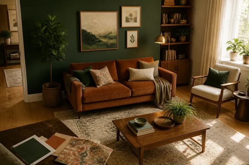
You bring home a deep green paint chip, hold it against the wall behind the sofa, and imagine the room finally coming into focus. The accent wall seems like the smallest possible intervention: one surface, one weekend, one decisive color. But a single bold wall does not act alone. It changes how the adjacent walls, furniture, floor, trim, and daylight read beside it.
The accent wall shortcut can work when the room already has a color relationship waiting to be clarified. It is less convincing when the painted surface is expected to solve a room whose other colors have not yet been considered. A useful pause comes before the paint can: look at the whole room and ask what the new color will have to live beside.
Color Is a Relationship
A color rarely looks the same in isolation as it does on a broad wall. A small sample might seem subdued beside a paint deck, then appear unusually saturated next to warm oak or a pale rug. The surrounding colors are not background; they are part of the impression the wall creates.
Start with what is already difficult or costly to change. Note the floor, large upholstered pieces, curtains, and any wood or stone that will remain. These fixed or substantial surfaces often carry more visual weight than a handful of accessories, so a wall color that disagrees with them can make the whole room feel less settled.
That disagreement does not mean every surface must match. A cool blue wall can sit comfortably with a warm timber floor if another element helps the two speak to each other. The aim is not uniformity but a relationship that feels intentional: repeated undertones, a shared level of warmth, or a smaller color that bridges the contrast.
Choose the Wall for a Reason
The obvious wall is not always the useful one. A wall behind a sofa may seem like a natural feature simply because the sofa faces into the room, while a wall containing doors, shelving, artwork, and a radiator may break the color into fragments. Look at the actual shape of the surface and what interrupts it.
Consider what the color should do. It might give a plain bed wall more presence, make a reading corner feel distinct, or draw attention to a useful architectural feature. If the only reason is that the room feels bland, the wall may be taking on a job that belongs to several smaller decisions, such as changing a lampshade, recovering a cushion, or bringing a repeated hue into the curtains.
Check the view from the room’s main entrance and from the places where you spend time. A bold wall can dominate when it fills the first view, or appear as a narrow stripe from the sofa. Neither is automatically wrong, but each changes the room’s balance. The intended effect should make sense from more than one habitual vantage point.
Read the Whole Palette
Before selecting a paint color, make a simple inventory rather than starting with a trend image. Include the largest visible areas and the colors that recur: wall paint, ceiling, floor, upholstery, window coverings, and any artwork that is staying. A phone photograph can help you notice clusters, but it can shift color; use it to assess placement, not to judge the exact shade.
Then look for a bridge. If a proposed wall color is strong, a quieter version of that hue in a cushion, ceramic bowl, print, or lampshade can make the choice feel connected to the rest of the room. A bridge need not repeat the color exactly. A related undertone or a neighboring color can be enough to make the palette feel considered.
Imagine you have a cream living room, a rust-colored sofa, and a dark green paint sample intended for the wall behind it. Before painting, you set the sample beside the sofa, the honey-toned floor, and a patterned cushion that includes both green and rust. If the sample makes the cushion seem unusually yellow, you might choose a softer green or bring in another small green element; the expected result is a wall that relates to the furnishings rather than competing with them.
Light Changes the Reading
Paint changes character as the light changes, and a dark wall can seem very different in morning sun, late afternoon shade, and lamplight. The room’s orientation, nearby trees or buildings, and the color temperature of bulbs all influence what you see. A color chosen from a bright store display may feel heavier in a north-facing room, while a warm hue can become intense in direct sun.
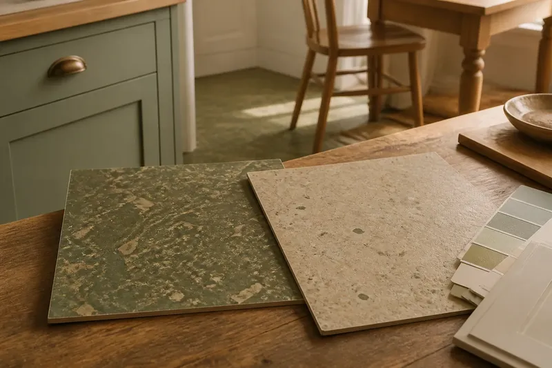
Use a large sample, or paint a board with the proposed finish, and move it around the room. Look at it beside the furniture and trim, then check it at different times and with the lights you normally use. A board is easier to reposition than a painted wall and helps separate the color’s character from the wall’s location.
Notice sheen as well as color. Matte finishes tend to soften reflections, while glossier paint can catch light and make surface irregularities more visible. The finish should suit the wall’s condition and the care it needs, not just the look of a color sample. Follow the paint maker’s directions for preparation and finish selection, especially where the existing surface or room conditions affect the choice.
What Should You Check First?
Which colors are hardest to change?
Begin with flooring, large furniture, and window treatments that will stay in place. A wall color should make sense beside these substantial elements before it is coordinated with small accessories.
How can you tell if a wall is too busy?
Look for doors, built-ins, artwork, switches, and other interruptions that divide the surface. If the proposed feature color would be reduced to disconnected patches, consider a calmer wall or a different location.
Should an accent wall be the darkest color?
No. A light, muted, or mid-tone wall can create distinction through contrast with texture, trim, or furnishings. Choose according to the room’s existing palette and the effect you want, not a rule that the feature must be dark.
What if the room still feels unfinished?
Check whether the palette appears elsewhere in the room before adding more contrast. A repeated color in a textile or object may make the wall feel integrated; if it does not, the room may need a different adjustment rather than a stronger paint choice.
When One Wall Works
A single bold surface is most convincing when it has a clear role and the rest of the room can support it. Repeated color, a compatible floor and trim, and a wall with a coherent shape all help. The accent can then provide focus without asking every other element to compete for attention.
It is also reasonable for one wall to be the main color statement. The room does not need matching accessories in every corner, and chasing exact repeats can make a space feel arranged rather than lived in. A few related notes are often enough; the remaining colors can stay quiet.
What is not worth the effort is buying a collection of small objects solely to justify a paint choice that already feels wrong beside the sofa or floor. Those purchases add visual noise without addressing the mismatch. Reconsider the sample while it is still a sample.
Decide Before Committing
Set the proposed color against the room’s fixed materials, view it from the places you use, and check it in both daylight and lamplight. Ask whether the wall strengthens an existing relationship or introduces a new color that has no companion. If it does the latter, try a more muted version, a different surface, or a smaller way to introduce the hue.
The accent wall shortcut is useful when it makes a room’s existing colors easier to read, not when it is expected to repair the entire palette by itself. Treating the wall as one part of a color relationship helps you make a decision you can live with, even if you ultimately choose to paint more than one surface—or none at all.